Adventures in Text Rendering: Kerning and Glyph Atlases

This is a deep-dive on text rendering — shaping, rasterization, and the challenges of optimizing for performance without sacrificing quality.
From game engines to web browsers to terminals, some apps forgo system UI frameworks and do the majority of their rendering directly on GPU in order to leverage context-specific optimizations. When it comes to text, these applications take on many responsibilities typically abstracted away behind higher-level system frameworks, and under-the-hood documentation can be hard to come by.
I want to start by sharing an overview of the text rendering pipeline, from font families through to pixels on the screen, after which I’ll get into a particular performance optimization for text-heavy applications like Warp, a GPU-accelerated terminal I work on. Here’s a table of contents if you want to see what’s coming, or to jump ahead:
- Text Rendering - a 10,000 Foot View
- Shaping - a 9,000 Foot View
- Rasterizing - a 5,000 Foot View
- Speeding up Text Rendering with a Glyph Atlas
- Replacing Approximations with Better Approximations
- Wrapping Up
- Appendix: Alternatives Considered
Text Rendering - a 10,000 Foot View
Before we get into the rendering process, we first need to understand the primary data source we rely upon - fonts.
A font is the collection of information necessary to display a string of characters with a particular design, weight (boldness), and style (like italics). Together, a set of fonts with a particular design are called a typeface or font family (think Times New Roman or Comic Sans). Fonts can be proportional - each character only takes up as much space as it needs - or monospace - each character takes up the same amount of horizontal space, independent of the width of the character itself (sometimes referred to as “fixed-width”). Most fonts you encounter on your computer or in your web browser are proportional, but in programming contexts, such as code editors and terminals, monospace fonts are almost universally preferred.
A font contains two main categories of data 1:
- Information relating to glyphs - graphical symbols representing one or more characters, and
- Instructions describing how pairs of glyphs should be positioned relative to each other.
When two or more characters are combined into a single glyph, it’s called a ligature. Traditional examples of ligatures include æ and ffi (a three-character ligature). Terminal users may be more familiar with ones that combine => into ⇒ or ~= into ≃, examples found in many programming-targeted fonts.
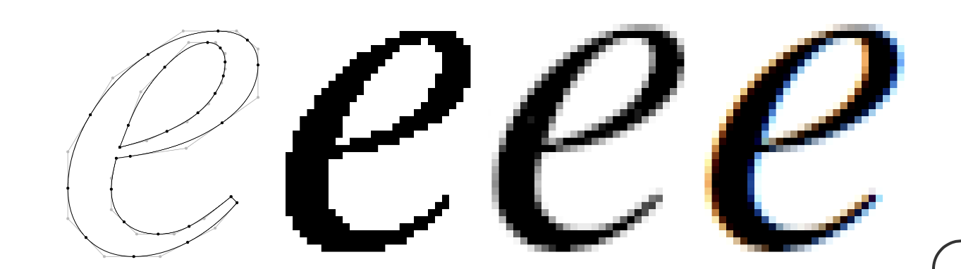
Most fonts represent glyphs as vector graphics (think SVG images) - mathematical descriptions of lines, shapes, and curves that specify the outline of the glyph. Some fonts are bitmap fonts (think JPG images) - these represent glyphs as grids of pixels (some on, some off). Vector fonts are much more common, as they can be scaled to any size, large or small, without any loss of precision or graphical fidelity.
Now that we know where the data comes from, how do we use it to turn a string of characters into some nicely rendered text? The process can be split into two main parts, shaping and rasterization.
Shaping: the process of taking a string of text - a list of (in our case, Unicode) characters - and converting it into a set of glyphs to be rendered at particular positions.
Rasterization: the process of taking a glyph (or other image) described in a vector graphics format and converting it into a “raster image” (or bitmap) - a series of pixels. Graphics chips don’t natively understand vector graphics, so rasterization into a bitmap is a necessary step when working with such data.
As alluded to above, there are more steps than solely these two - itemization, line breaking, and justification are also involved in the overall layout process.
Both of these are quite complicated 2, and almost all applications delegate the heavy lifting to libraries, usually native to the operating system. On MacOS, both layout and rasterization are performed by Apple’s Core Text library. On Windows, the equivalent is Microsoft’s DirectWrite library. On Linux, things are less standardized, but Pango is a common choice for layout, and FreeType is a common choice for rasterization. While we can rely on libraries to do the work for us, we still need to understand a bit more about these two processes.
Shaping - a 9000 Foot View
The first part of shaping we care about here is conversion from a list of characters to a list of glyphs. In some languages, like English, conversion is straightforward, using a 1:1 mapping from character to glyph, with ligatures being optional aesthetic choices. Use of ligatures is determined by querying the font’s ligature data tables and identifying if any substitutions are to be made.
In many other languages, however, substitutions are required for correct display of the text. An example described in the documentation for HarfBuzz, a popular shaping engine:
For example, in Tamil, when the letter "TTA" (ட) letter is followed by the vowel sign "U" (ு), the pair must be replaced by the single glyph "டு". The sequence of Unicode characters "ட,ு" needs to be substituted with a single "டு" glyph from the font. But "டு" does not have a Unicode codepoint. To find this glyph, you need to consult the table inside the font (the GSUB table) that contains substitution information. In other words, text shaping chooses the correct glyph for a sequence of characters provided.
Arabic is another example, where the glyph used for a particular character is dependent upon the character’s position within a word or string of text.
Once we have obtained the list of glyphs that represent a given string of text, we still need two more pieces of information to render the string: the positions of the glyphs and what they actually look like. We’ll start with positioning, as that’s a bit easier.
The shaping engine operates independently of position on the page and the bounds of the render area - it acts as though there is an infinitely wide space to lay out the text. Ultimately, it is solely concerned with where a glyph should be located relative to its predecessor - a property known as the glyph advance (how much you advance along the x- and y-axes to arrive at the position of the next glyph). Advance is independent of the width of the glyph itself - for example, a space character has no visual width, but has a non-zero advance (to separate the previous and next characters from each other).
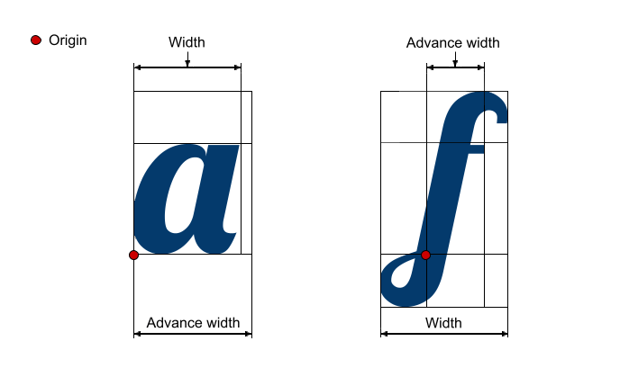
For monospace fonts, used by Warp for terminal input and output, glyph advance is a constant - a fixed amount of spacing is used between all pairs of glyphs. For proportional fonts, the advance is variable, as different glyphs have different widths. A lowercase L is narrower than an uppercase W, and using the same advance for each would either cause awkwardly large gaps around the lowercase L or leave the W feeling cramped.
Unfortunately, simply factoring in the width of the glyphs isn’t sufficient to produce good-looking text with a proportional font. Some glyph pairs - such as capital A and V - just feel too far apart, even with glyph width factored in, due to their shapes. In these situations, font authors specify an additional adjustment factor that should be applied to this pair of glyphs in order to keep everything visually pleasing. The process of making these adjustments is called kerning 3.
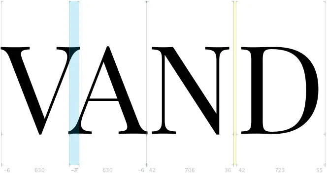
Text with bad keming (sorry, had to!) looks awkward and is often slower to read, especially when too-close-together-letters make it hard to visually parse. Font creators will manually override the advance between pairs of characters in order to maintain readability and improve aesthetics. Notice in the image above the degree of overlap between the V and A - without a kerning override, the text would look more like “V AND”.
Now that we know where the glyphs should appear, what exactly do we draw in those locations? What should the glyphs actually look like?
Rasterizing - a 5000 Foot View
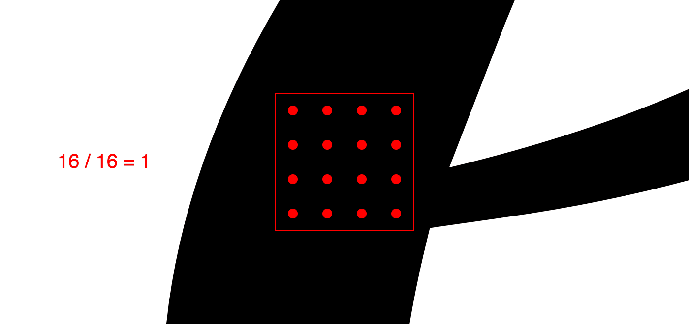
As described above, for vector fonts, we’ll need to rasterize our glyphs (convert from vector -> bitmap) to put them on the screen. At a high level, this is accomplished by “placing” the vector description of the glyph on top of a pixel grid, and checking which pixels are contained within the glyph’s “inked” regions. Here, a picture is easily worth 1000 words:
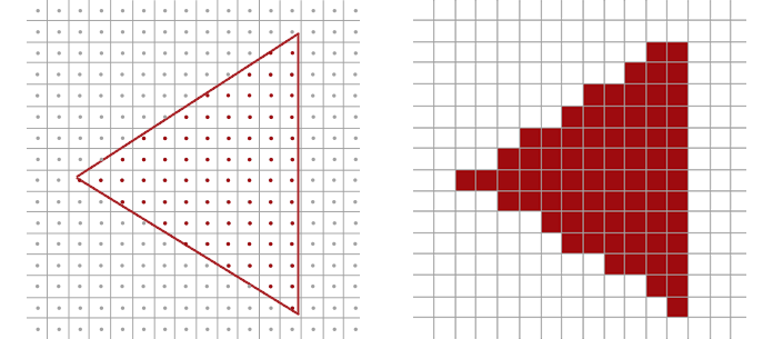
The simplest rasterization strategy is the following: for each pixel under consideration, check whether the center of the pixel lies within the vector outline. If it is inside the outline, the pixel is turned on. If it is outside the outline - even by the slightest margin - the pixel is completely ignored. (This binary on/off is referred to as black-and-white or bi-level rasterization.) While this is an easy computation, the results don’t look very good - a simple triangle starts to look messy when it doesn’t align nicely with the underlying pixel grid. The triangle on the right is aliased, a term from signal processing used to describe inaccuracy caused by a misalignment between the signal frequency (our vector outline) and the sampling frequency (our pixel grid).
To eliminate the jagged edges, we need to leverage a process called anti-aliasing (who could have guessed!). If our sampling (pixel centers) doesn’t produce an accurate approximation of the source material, we can increase our sampling frequency to obtain a better estimate. One anti-aliasing approach is supersampling - checking a handful of points within each pixel, and shading the pixel based on the percentage of samples that were within the vector outline.
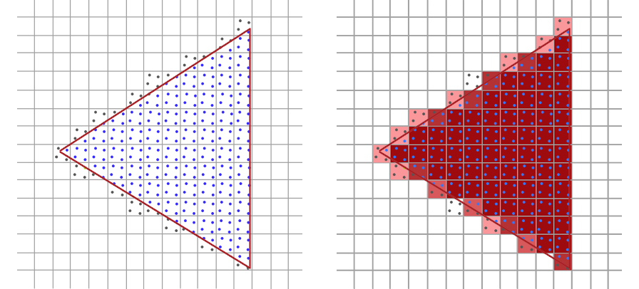
In our triangle example, increasing our sampling frequency improves the accuracy of the rasterized image - note, for example, how the top corner of the triangle is no longer missing. Better approximations of the original vector data can be achieved by increasing the sampling rate, but at increased cost (linear in the number of samples). The exact same process works for complex vector shapes (like glyphs) in addition to triangles:
Modern text rendering takes things one step further, leveraging the fact that LCD monitors have three separate, independently-controllable sub-pixels that comprise the red, green, and blue components of each pixel. This process, sub-pixel anti-aliasing, performs sampling at the level of each sub-pixel, and adjusts the result to ensure the colored sub-pixels don’t affect the perceived color of the glyph.
While it’s generally agreed that it produces better results on lower-resolution displays, not all platforms support sub-pixel anti-aliased rasterization. In fact, MacOS dropped support for it with the release of Mojave, as the marginal benefits on their high-DPI “retina” displays don’t outweigh the complexity of the implementation 4.
TL;DR: - Text rendering is a matter of deciding where glyphs should go, converting any vector glyphs to bitmap representations, and then displaying those bitmaps on the screen. Sounds easy! So, uh, why did I bother writing a blog post about it? As is often the case when we move beyond the simple solution - performance :)
Speeding up Text Rendering with a Glyph Atlas
Unsurprisingly, converting a lot of vector-described glyphs into their bitmap equivalents isn’t the fastest operation. Well, what do we do when we perform an operation multiple times and the output is always the same given the input? 5 Add a cache!
We could cache at two different levels: a line-level cache (cache an entire shaped and rasterized line of text) or a glyph-level cache (cache each rasterized glyph). Given the fact that most of our glyphs are part of the monospace terminal grid, where we use a fixed advance and can ignore kerning, and that the contents of a line can change frequently as data is written to stdout/stderr, a glyph-level cache will provide a better tradeoff between performance and memory consumption - a line cache would contain many copies of the same rasterized glyph.
Given our use of the GPU for rendering 6, what we specifically want to build is a glyph atlas.
A glyph atlas is a GPU texture (image) which contains all of the rasterized bitmaps for the glyphs we need to show the user. Instead of performing the vector → bitmap conversion every time we redraw the application, we store the result in a texture and then ask the GPU to “copy” the bitmap from the atlas texture to the correct location in the output buffer (the texture where we’re rendering the window contents). We combine font ID, glyph ID, and font size to form our cache key, ensuring that any “scaling” is performed by the rasterizer, which would produce much crisper results (when scaling up) than nearest-neighbor or bilinear scaling on the GPU. When an atlas texture fills up with glyphs, we create another one; at rendering time, we tell the GPU which texture holds the glyph in question and where in the texture the glyph is located.
For the terminal grid, this works great! We can easily map a (row, column) pair within the visible section of the grid to a screen position, and have the GPU copy a glyph from the atlas to that position in the output buffer. As we build up the list of rendering instructions for the GPU, if we need to display a glyph that isn’t yet in the atlas (a cache miss), we rasterize it and insert it into the atlas texture. This “lazy” cache fill strategy helps us minimize GPU memory consumption.
But what about the rest of the UI? With proportional fonts (like Roboto, which we currently use to render UI text), the advance between two glyphs could be a value like 2.46px. Can we just 7 ask the GPU to position the glyph at a fractional horizontal position? Sure! The GPU can do this easily - when a destination pixel isn’t aligned with a single source pixel, the GPU will blend together the values of all 2 or 4 overlapping pixels (proportionally) to determine the value of the destination pixel. Nice!
Well, not so fast. When source and destination pixels aren’t aligned, letting the GPU do the blending leads to blurry fonts. No good.
The easy solution here, and the one Warp utilized for a long time, is to round the glyph’s horizontal position to the nearest pixel boundary to avoid GPU blending. While we keep text looking crisp (yay!), we’re not respecting the precise positioning information provided by our shaping engine, meaning we end up with poorly-kerned text (and unhappy users - boo!).
So - how do we retain the performance benefits of a glyph atlas, avoid blurry text, and ensure proper kerning?
Replacing Approximations with Better Approximations
As mentioned above, the output of the rasterizer depends on how the vector-based glyph overlaps the underlying pixel grid, so limiting the “cache key” for our glyph atlas to (font\_id, glyph\_id, font\_size) isn’t correct - we need to add a component that encodes the position of the glyph relative to the pixel grid.
Ok, that’s not too hard - let’s stop snapping the glyph position to the nearest pixel boundary and make the cache key (font\_id, glyph\_id, font\_size, fract(glyph\_position.x)). Unfortunately, this effectively renders caching useless - the set of possible floating point values in the range 0,1) is quite large, and we can’t even be confident, due to floating-point imprecision, that we’ll always get equal values for the fractional horizontal position. Given one of the benefits of a glyph atlas is a reduction in memory usage, we probably don’t want to have a cache with unbounded size :).
If we don’t want to use one copy, and we don’t want to use “infinite” copies… what if we use N copies?
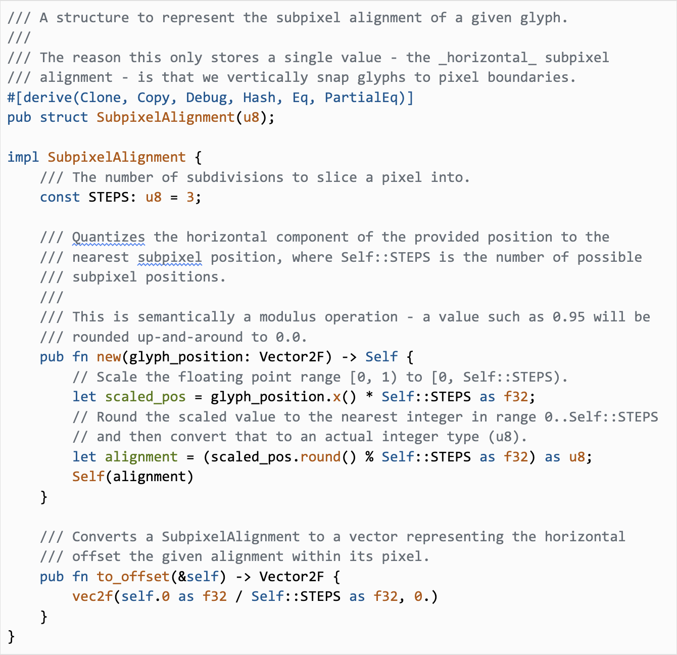
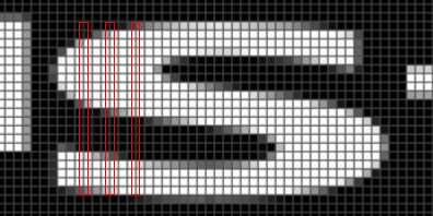
The code above is what I added to help us snap glyphs to a sub-pixel grid. Here, we split each pixel into 3 equally-sized subpixels, and round the horizontal position to the nearest subpixel (an offset of 0.0, 0.33, or 0.66px). Instead of using the full-precision fractional component of the glyph’s horizontal position in the cache key, we use the sub-pixel alignment, limiting the number of rasterized variants we pick from (and thus limiting the maximum increase in memory consumption). Now, when we’re rendering glyphs, we check the glyph atlas for sub-pixel aligned glyphs, and rasterize a glyph at the appropriate sub-pixel position if it isn’t present in the atlas.
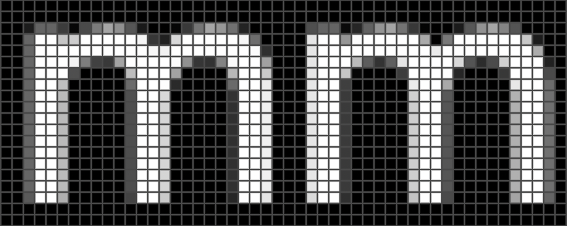
As we learned earlier about rasterization, the result depends on how the signal (the “m” vector representation) aligns with the samples (the pixel grid). When we shift the glyph over by a fraction of a pixel, we get a different output from the rasterizer. If we’re supposed to render an “m” with a horizontal position of 2.46px, we’d “round” that to 2.33px (the nearest ⅓ sub-pixel) and use a glyph rasterized at an offset of 0.33px. While this still wouldn’t be as accurate as a glyph rasterized at the exact offset of 0.46px, this is a better approximation than using an offset of 0.0px.
Once we get the rasterized “m” at an offset of 0.33px, we can tell the GPU to copy it to the output buffer. There’s one last adjustment, though - we’re already encoding 0.33px of the horizontal position into the rasterized glyph, so we need to subtract that from the position we pass to the GPU. From our codebase:
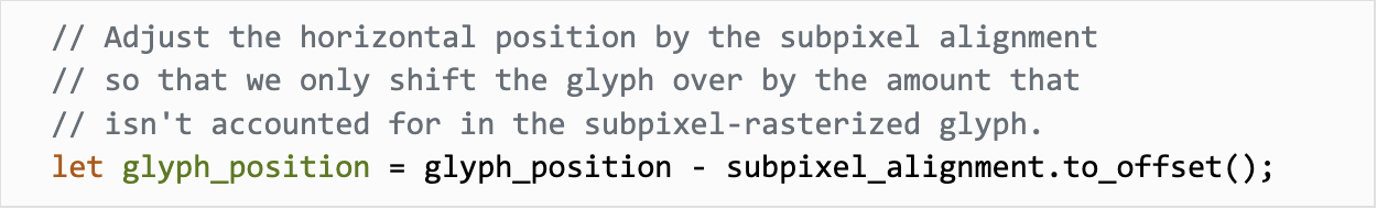
Ultimately, we copy the 0.33px-rasterized “m” over to the output buffer with a horizontal position of 2.13px. The result is close enough to the “correct” rasterization that errors are hardly perceptible. If we needed increased precision, we could use 4 sub-pixel alignments instead of 3 (explicitly balancing correctness with memory consumption) but, so far, that hasn’t been an issue.
Wrapping up
In the end, the fix for our lack of kerning was a relatively small amount of code (the pull request changed <200 lines, mostly Rust, with a couple minor edits to Metal shader code) but required significantly more learning, tweaking, evaluating, and iterating.
I hope you found this to be an informative and interesting dive into the enormous rabbit-hole of complexity that is text rendering! If these sorts of problems are interesting to you, Warp's Engineering team is hiring! We’re looking for outstanding Software Engineers who want to work on re-imagining a product that all developers use every day.
If you haven’t tried Warp yet, you can download it using this button (heads up that this is Mac only for now):
And if you encounter any issues with our text rendering, let us know and we’ll look into it. (No guarantees on another blog post, though. 😛)
Appendix: Alternatives Considered
A valuable section to include in any design doc (or technical blog post), why did we land on this approach? What else did we try but ultimately discard?
One correctness improvement would be, for intermediate values like 0.42 (between the 0.33 and 0.66 sub-pixel alignments), to interpolate between the two nearest rasterized glyphs instead of simply using the single nearest glyph. While it would produce technically more correct results, it is significantly more difficult to implement - we need to read from two different rasterized glyphs, which could be located on different atlas textures. Either we need to add complexity to the code that sends instructions to the GPU (to ensure both textures are available) or we need to guarantee that all sub-pixel variants of a given glyph are part of the same texture. The latter is most easily addressed by rasterizing all sub-pixel variants the first time that any are needed, which eliminates the benefits of our lazy rasterization strategy. The added complexity and cost here didn’t outweigh the benefits of more-correct (but perceptually largely indistinguishable) rendering.
Another option for improved results would be using supersampling (yes, the same anti-aliasing technique mentioned earlier). When rasterizing the glyph, we could ask the rasterizer to scale up the vector horizontally by a factor of 3 (matching our chosen sub-pixel count) and produce a glyph bitmap that is 3x the normal width. When rendering the glyph, we would skip forward 3 pixels in the horizontal direction to account for the scale factor, as shown in the diagram below:
It turns out that this is more-or-less the same as the other alternative, but with the three glyphs interleaved with each other - the first column of each glyph (0.0, 0.33, 0.66), followed by the second column of each glyph (1.0, 1.33, 1.66), etc. The GPU shader code to read from the glyph atlas would be a bit simpler (we can read from the texture at a fractional horizontal position and let the GPU interpolate between adjacent pixels for us), but we’re still losing out on lazy rasterization, and the larger glyphs don’t fit as efficiently into the atlas. Again, while the results might end up being slightly better, the tradeoff isn’t worth it.
1
Font files store quite a lot of different types of information necessary for font rendering. If you’d like to dig deeper, Microsoft’s documentation on the OpenType font file format is a great place to start.
2
This blog post from Ryan Juckett about his work on text rendering in his game INVERSUS starts with a fantastic list of the challenges and pitfalls involved in building a robust text rendering pipeline.
3
There is quite a lot of complexity in kerning on the font creation side. For an in-depth example of how kerning is performed using a particular font creation application, Glyphs, check out their page about kerning.
4
A Hacker News post here from a former MacOS engineer outlines some of these complexities.
5
If this felt wrong to you while reading it - good! There’s a “bug” in the algorithm here; keep reading. :)
6
If you’re interested in more details on how we use the GPU to render Warp, check out our How Warp Works blog post for a higher-level overview, or How To Draw Styled Rectangles Using the GPU and Metal for a deeper dive into rounded rectangles and gradients.
7
Over the years, I’ve come to realize that “just” is a dirty word in software engineering - it almost always hides important complexity that should be actively discussed, not hand-waved away. (I could write a whole blog post about this). Why did I use it here? Keep reading. :)
Related articles

Jun 29, 2026 · 5 min
How to build a cloud software factory - add spec-driven development skills
This is my second post in a series on how to build out a fully automated cloud software factory. In this post, I’ll show how you can add spec-driven development for issues that are too complex or ambiguous to one-shot. The goal of these posts is to build a fully working...

Jun 25, 2026 · 7 min
How to build a cloud software factory - the automatic triage skill
This post is the first in a series I’m doing on how to set up your own cloud software factory using skills and loops. It’s easier than it sounds to get something simple and effective running so you can start to automate significant parts of your team’s development flow.

Jun 18, 2026 · 4 min
Building a skill optimization loop
This post shows how to create a loop with automated feedback that an agent can run to optimize its own Skills. It uses an automated grader with computer use to assess how well a Skill is performing, and then iteratively improves the Skill.